As Barack Obama took the Oath of Office as the 44th President today, another important piece of state business was happening on the other end of Pennsylvania Avenue: turning on the Obamaified WhiteHouse.gov.
This bit of “change” is of heightened interest because of the adeptness with which the Obama team used the Web during the campaign and the transition. Though myriad challenges remain with the use of social media and user generated content in government — as detailed by this excellent Wired magazine piece this month — the Obama team shows every sign of plowing right on through antiquated readings of the Presidential Records Act that have been used to prevent such things as the creation of a White House YouTube account in the Bush Administration. And voila, here’s the official Obama White House YouTube account, with comments and ratings enabled.
As a general rule, anything “new” that the White House does with its website will be singled out for praise in the media, even if it isn’t particularly new or interesting in the context of the Web. For instance, a YouTube channel. Or a blog, even one without comments or conversation. Though its offerings will undoubtedly expand — Sean Hackbarth tweets about passages in the privacy policy that seem to suggest the possibility of user video submissions — the true test of whether Obama will be as groundbreaking online in government as he was in the campaign will come in the coming weeks and months.
As a Republican but also as a citizen, I’m eager to see more transparency and real dialogue from the White House online. Change.gov was great at allowing users to comments and vote up ideas but conveniently, the only ones highlighted by incoming Administration officials were ones that supported its existing message. In doing so, the Obama team enlisted the participatory ethos of the Web in support of rigorous message discipline. This is certainly a best practice for political management of the open Web, but it’s up to us to demand a higher standard. Did you know, for instance, that the Bush-era “Ask the White House” feature always went out of the way to include at least a few challenging questions to Administration officials in online chats?
Other thoughts and observations, good, bad, and ugly:
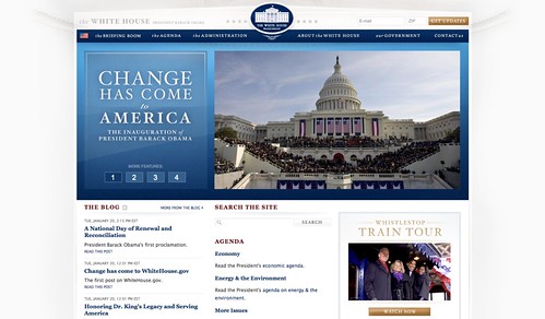
- Though beautiful as I expect any Obama design by John Slabyk design to be, I was expecting something a bit more majestic for the White House site. Obama’s design efforts have gotten progressively more workmanlike since the campaign site was refreshed with ethereal, cloud-like design in early 2008. I was expecting a return to something more like that now that Obama actually is the President, rather than pretending to be the President with fake seals and federal imagery.
- The new site fails in one respect: I can’t get a transcript of today’s Inaugural address. Several people on Twitter have reported that the text was there, but was removed. (Change!) As someone who spent part of the Bush Administration waiting for the White House to post things with Swiss clock-like efficiency, I had grown used to a standard where speeches and fact sheets were up within the hour. Given the challenges of moving in, things probably won’t run as smoothly on Day 1, but despite all the social media bling, you can’t forget that a key function of the site is to get information out in a timely fashion. Also: are they planning on jamming all speech and fact sheet content into a blog, having the effect of 1) making it less of a blog, and 2) ensuring that information is completely hard to find? I am all for junking the traditional press release, but there is value in putting speeches up in a structured format in a newsroom and keeping the blog the authentic “voice” of its authors.
- The large, rotating headline feature area to drive key messages was long overdue on a White House site, and the implementation is superb.
- A departure from previous Obama sites, WhiteHouse.gov is built in Microsoft’s proprietary .NET framework, something that is sure to cause no small degree of consternation among the President’s devotees in the open source community.
- I am surprised that the Obama team is not doing more to collect e-mail addresses, sticking with the traditional upper right hand placement of the e-mail signup box but little else. Traffic to the White House site is the envy of anyone who works primarily with campaign websites, and they could probably build a list of millions in short order with splash pages and interactive features. I fully expect to see more of this in the coming weeks.
- The design seems to be influenced by Andy Rutledge’s 2006 critique and suggested alternative, which consisted mostly of making the homepage a glorified sitemap. The current homepage isn’t quite that bad, though the extended footer is evocative of it.
Though a work in progress, I do think this is a solid first effort from the Obama team. What do you think?