The common wisdom is that BarackObama.com is not only better at wrangling donations from the faithful, but is categorically better than JohnMcCain.com because it embraces an interactive as opposed to a broadcast model. Time‘s Michael Scherer put it this way last April:
Even today, if you go to McCain’s website, you are more likely than not to find a page that just asks for money and broadcasts the campaign’s message, with issue papers, press releases and videos.
By contrast, Obama’s website is engineered for engagement: prompts invite people to volunteer, make phone calls and find nearby events. “Don’t just fill out this volunteer form and wait,” it reads. “Get started on your own.” The blog is maintained by a former journalist; the social-networking function is managed by a founder of Facebook.
I don’t disagree as far as BarackObama.com’s depth of content goes. But let’s not kid ourselves. At its core, BarackObama.com is not truly interactive. It is transactional.
The first time you hit the Obama website, you’ll get a splash page prompting you to sign up for the email list. This is good practice, as the sign up form can get lost in the message-of-the-day clutter of the homepage. This way, you can change the homepage at will while still focusing on the most important thing: getting new people to sign up.
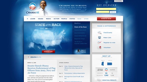
But the difference on BarackObama.com is this: the homepage above the fold hardly ever changes.
The main graphic on BarackObama.com has been the same for the last three weeks: Join Barack at the “Open Convention,” leading to a donation form. This is what they’ve had up ever since they announced Obama would be delivering his acceptance speech from Invesco Field in Denver.

And what about Obama’s much-touted Berlin speech? The story about Obama’s European trip is the second item in the homepage feature, and video of Obama’s speech is three deep.
This is no different than what they did in the primary. The majority of the time — from January through June — the main homepage graphic was a toteboard of all the states leading to a contribution page. This should look awfully familiar to everyone by now:
Conventional wisdom holds that major websites should change daily. But Obama flouts this conventional wisdom by hitting every user 1) once with a signup splash page, and 2) with a constant ask for money as the prime feature on the homepage, even if there are more current or important stories to tell.
This is neither good nor bad, but suggestive of the fact that the Obama homepage is compulsively metrics-driven. The campaign would not use this graphic if it did not produce more money than the alternative — even if the alternative was newer and made more sense intuitively.
As the frontrunners online, the best of the Democratic campaigns tend to be more boring and less innovative than their Republican counterparts. The transactional imperatives evident in the Obama homepage and email program suggest a well-honed machine run like IBM at its peak, not a hungry, innovative startup. We know that splash pages and static asks for money work. So why change?
The Kerry 2004 email list was all asks for money. The Obama list is mostly asks for money, albeit often creatively disguised, mixed in with some grassroots riffing off the BC’04 model. In both 2004 and 2008, Republican emails have tended to feature a broader range of action items drawing off the three M’s — message, money, and mobilization. Democratic emails are mostly about money.
The last McCain email I received wasn’t about money, but the August 14th McCain Nation house parties. The RNC has been one innovation after the other: the Platform website, the GOP Toolbar, Can We Ask? The Obama camp or the DNC never tell me what’s new without hitting me over the head for money, and hardly ever prominently launch a new feature without some ulterior motive (signups or money).
It’s not that Obama doesn’t do anything innovative beyond money. It’s that they hide it. The Obama campaign has launched a cool Neighbor-to-Neighbor tool letting you go door to door to talk to voters, but it’s buried in My.BarackObama.com, and hasn’t been advertised in email (which would get a bigger response than a simple announcement in the MyBO dashboard). I didn’t even get a targeted email promoting it as a resident of swing state Virginia or as a MyBO registered user.
The Democrats are locked into an email fundraising model because it’s a massive cash cow — in the same way Microsoft was locked into the Windows franchise or IBM was into the original PC. This works — for a while. Until someone else, like Google or Apple, discover a new model.
In my experience, Republican campaigns tend to be hungrier because they aren’t as wedded to the email cash cow. Most of the campaigns I see experimenting with user-generated policy, with next-generation campaign websites, with Twitter, or with money bombs are Republican. The current responsiveness of the Democratic base makes everyone on their side look like a genius, but in reality, it’s easy to get lazy and complacent while forgetting what made stuff work in the first place. Online, Democrats may be the safe insiders and Republicans could be the outsiders poised to upset the apple cart.
Republicans online have had to work harder to find a unique angle that works. That discipline will serve them well once their base comes around to decent levels of responsiveness.