As we look back on the past decade of innovative design and bold strategy, it is impossible to ignore that Engage has grown and changed. Over the past ten years, we have tackled a wide range of problems for a wide range of clients, spurring our evolution from a small digital campaign shop to an award-winning digital service agency. With that growth and inward reflection in mind, we wanted to reimagine our brand to reflect how our capabilities and culture have changed. Thus, we are excited to unveil our brand refresh, a signature that captures us and better demonstrates who we are, what we do, and where we are going.
While our old brand has served us well over the past ten years, we recognize that our evolution necessitates that our brand adapts with us. The former logo simply lacked versatility and proved difficult to be applied across all branded assets. So we set the wheels in motion for a refresh. Our end goal was to design something with meaning, impact, and longevity while also paying tribute to the past ten years of the Engage brand.
The original “logo” for Engage was a word mark: “engage” set in Helvetica centered in a red rectangle. The mark was a holdover from when it headed our 2007 website with a flap to show overlap—a design trend at the time. Eventually, when the mark was needed for other uses like business cards and letterhead, the flap was removed. That logo has faced a series of design alterations over the past ten years: we removed the rectangle, modified the red, and modernized the logotype.
The 2017 brand refresh needed to solidify the efforts to adjust our typography and colors over the years. We also realized our need for a brand mark to accompany the new logotype. In the past, we had defaulted to a lowercase ‘e,’ but that never felt quite right. Our new mark needed to represent who we are now and where we are going—out of the Washington D.C. area to help causes outside our borders.
Say goodbye to Helvetica Neue Bold, and welcome the future of Engage.
![]()
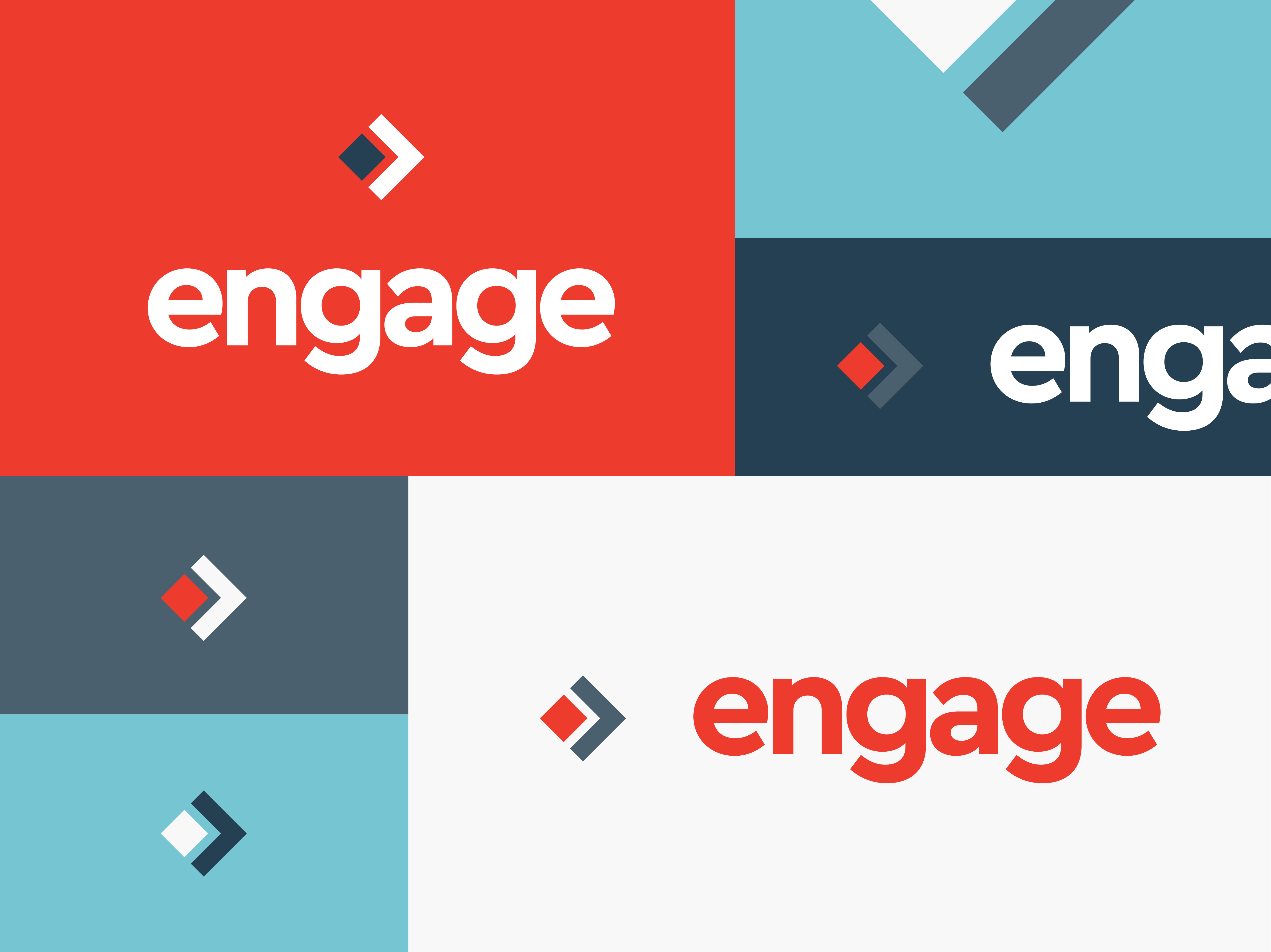
Our new logotype and brand mark have been carefully crafted to pixel perfection. We matched the angles used in our new brand mark with the custom-spaced logotype, using 45° chiseled terminals. The new 2017 brand encapsulates our prospect for a bold future—through a strong bright red color—and our culture of innovation—through a distinctly angular font. And we were able to pay tribute to the old while still encapsulating the new.
![]()
The brand mark itself draws inspiration from original boundaries of the District of Columbia plotted by George Washington. Prior to the retrocession of Virginia in 1846, D.C. was originally in the shape of a diamond, reflected in the red shape of our brand mark. Next, we placed a forward moving arrow around the diamond. This was representative of Engage extending our skills and services beyond the District.

Our design team worked through countless options and iterations before landing on the right fit. They demonstrated patience throughout the design process and collaborated with the entire Engage team on type lockups, brand mark variations, and color palettes. This was a true team effort, and we couldn’t be more proud of the end result. We hope you enjoy the new Engage as much as we do.